
LiveEO Redesign - Getting the Brand to the Point
Published on Tue, 07.02.2023 – 09:07 CET in Internals, covering LiveEOThe Berlin-based NewSpace startup unveiled its new visual identity in February 2023. The brand now looks fresher, more modern and more confident. But LiveEO's redesign has more than just aesthetic reasons.
A brand is more than just a logo or a name. It identifies the sender, conveys a value proposition, and is an expression of the corporate identity. Even from these - not exhaustive - points of view, it is clear that it should be revisited from time to time. With the redesign that has now taken place, LiveEO says it captures what the company has set out to do: "Improve and protect life on Earth with AI technology." Paris-based agency New Normal, founded in 2021, is responsible for implementing the redesign.
Momentum, vitality and emotion
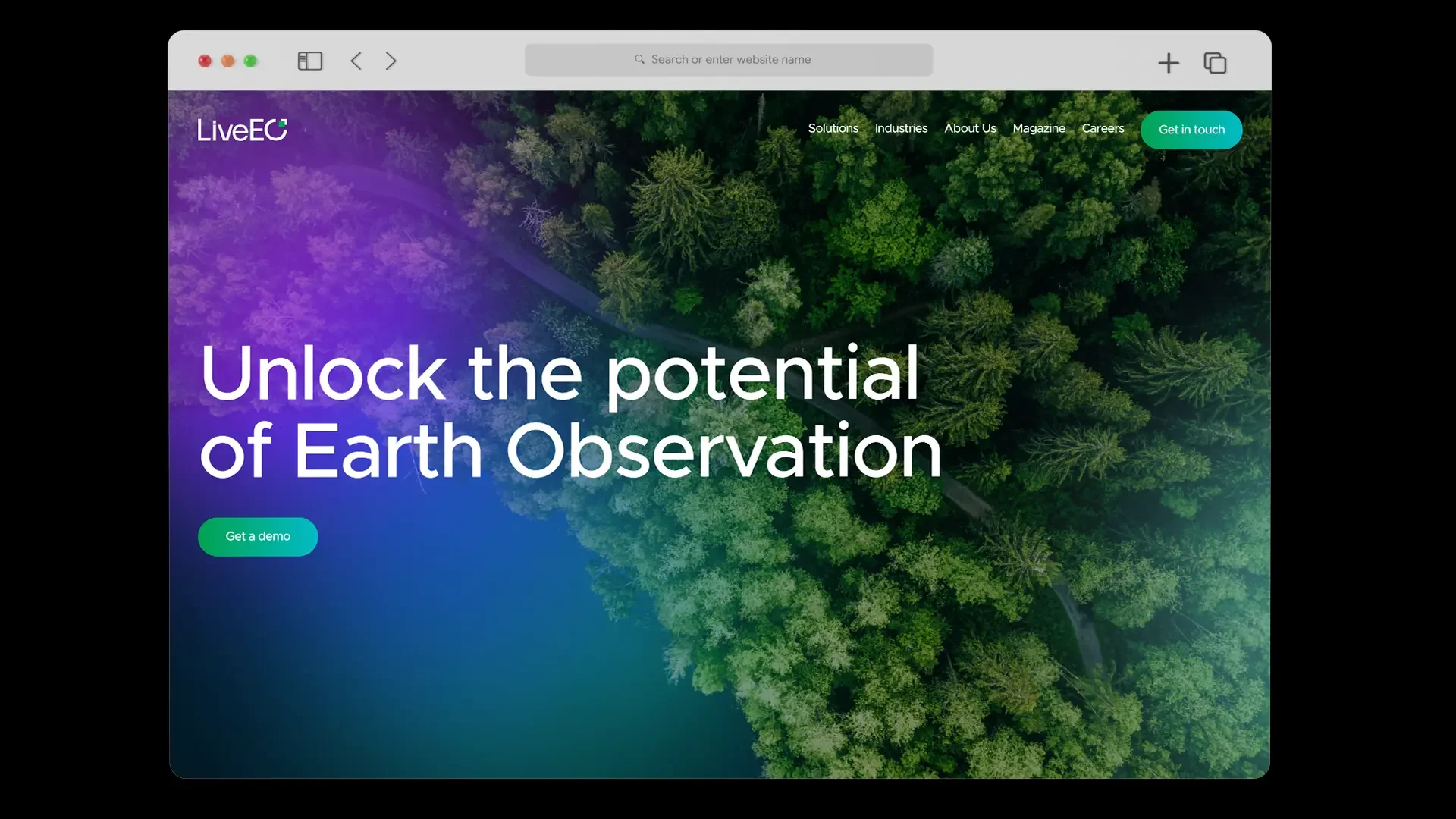
The changes are already visible on the homepage of the NewSpace startup. The page has been tidied up, there are full-screen images and numerous micro-animations. The latter can be quite demanding, especially for older computers, but this step is worthwhile from a purely visual point of view. In addition, the dark blue and purple overlay of the past has given way to varied color gradients that cover images as well as headlines and buttons. The variance adds a subtle sense of vibrancy.
Corners, edges and confidence
Perhaps the most noticeable change is the new logo, which is now much more minimalist in its presentation. The stylized globe has given way to an "O" with a recessed corner, and the typography used is much more confident. To avoid speculation or misinterpretation, LiveEO provides the iconographic reading at the same time.
The two pixels in the design are a nod to the digital space, while at the same time representing the satellites orbiting earth and the data layers we create on top of the world. The green pixel, like a notification in the top right corner, symbolizes the actionable insights generated by our software.
LiveEO Magazine
Redesign for practical reasons
According to LiveEO, the company is currently focusing more on UX/UI, or user interface design. The goal is to offer products that are as user-friendly and intuitive as possible. In this way, a "seamless and enjoyable experience" should enable customers to "unlock the full potential of our cutting-edge technologies." This is a particularly important point for LiveEO. Ever since the introduction of the iPhone in 2007, it has been clear that intuitive, easy-to-use technology is an important key to success for those who provide it. The more self-explanatory the functionality and the smoother the transitions between tasks, the more fun it is to use. And there is no more commendable approach than using Earth observation technology to make protecting life on Earth a fun task that people want to do every day. With this in mind, LiveEO's redesign went right to the heart of its brand.

Berlin SpaceTech LiveEO receives €800k from ESA
LiveEO and UP42 sign contract worth millions

LiveEO raises 19 million euro investments
NewSpace initiative founded

LiveEO wins at Planet Purpose Award

LiveEO starts vegetation monitoring for E.DIS